
These fabric and apparel class 12 notes give you the whole chapter in a revision-ready form: design fundamentals, the elements and principles of design, and the three applied practical techniques — tie and dye, batik and block printing. They follow the 2026-27 session and are aligned to the Rationalised NCERT textbook.
The chapter belongs to Unit IV of Human Ecology and Family Sciences Part II and centres on the fundamentals of design in fabric and apparel, plus the practicals that apply those fundamentals. The same design vocabulary and principles carry into every later area of the unit, so mastering this chapter is the base for fashion design and merchandising as well.
Work through the page in order, or jump straight to the section you need. Page references such as (NCERT, p. 160) appear throughout so you can go back to the book whenever you want the full explanation.
Fabric and Apparel: Chapter at a Glance and Page Map
The Fabric and Apparel unit of Class 12 lists five areas of study: design fundamentals; fashion design and merchandising; production and quality control in the garment industry; conservation of textile products in museums; and care and maintenance of fabrics in institutions. This chapter teaches the first area — design fundamentals — and closes with three applied practicals.
It belongs to the same book as the Class 12 Home Science notes for Human Ecology and Family Sciences Part II.
| Topic | Where in the chapter | What it covers |
|---|---|---|
| Unit introduction and learning objectives | pp. 153–157 | Scope of the subject, the five unit areas, lesson goals |
| Elements of design | pp. 158–167 | Colour, texture, line, shape/form, pattern |
| Principles of design | pp. 167–169 | Proportion, balance, emphasis, rhythm, harmony |
| Career options and scope | pp. 169–170 | Fabric vs apparel design, courses, industry scope |
| Review questions | p. 170 | Five questions closing the chapter |
| Practicals | pp. 171–175 | Tie and dye, batik, block printing |
These page references follow the layout of the official NCERT textbook PDF for Human Ecology and Family Sciences Part II, which you can open to verify any figure or page.
After this section, a learner is expected to discuss the concepts of design, recognise its elements, explain how the principles are applied to fabric and apparel, and discuss preparation for a career in the field (p. 157).
What is Design? Function, Harmony and the Structural–Applied Split
Design is a familiar word, but the chapter gives it a precise meaning. In everyday talk, design may mean the cut and style of a dress or the colour and print of a fabric — but design is not mere decoration. An object that is aesthetically pleasing but not functional, or not appropriate to its use, is not well designed.
In the broadest sense the textbook calls design harmony in form, and the greatest harmony comes when the aesthetic aspect of a good design is truly integrated with the utility of the object (NCERT, p. 157).
The textbook’s working definition runs: “Design is the human power to conceive, plan, and realise products that serve human beings in the accomplishment of any individual or collective purpose” (NCERT, pp. 157–158). In practice, a good design is also the right use of materials — it gives people what they expect in price, colour and service.
Design is analysed in two aspects: structural design and applied design (p. 158).
| Aspect | What it depends on | In fabric | In dress / garment |
|---|---|---|---|
| Structural design | The form of the object itself, not added ornamentation | Basic fibre processing, fibre and yarn types, variations of weaving and knitting, the stage at which colour is added | The basic cut or silhouette of the garment |
| Applied design | Superimposed on the basic structure | Finishes, dyeing and printing, embroidery and fancy needlework | Trims and notions (fasteners) that add value to the final product |
A plain woven cotton fabric shows structural design; the print and embroidery added to it are applied design. The same logic holds for a dress: the cut is structural, while trims and buttons are applied.
The chapter then splits design into two factors: the elements (the tools of the art — colour, texture, line and shape/form) and the principles (how the tools are combined — harmony, balance, rhythm, proportion and emphasis) (p. 158). Fabric and dress design obey the same grammar of art as architecture, painting or sculpture.
Elements of Design: Colour, Texture, Line, Shape and Pattern
The four elements a designer works with are colour, texture, line and shape or form; pattern is formed when shapes are grouped together. This section treats each one with the sub-concepts you need for a complete answer.
Colour: How the Eye Sees It
Colour is a visual sensation, not a property glued to an object. Visible light rays strike an object’s surface, reflect off it, hit the retina and stimulate nerve cells; the brain then produces the sensation we call colour (p. 159). An object looks white when all rays are reflected and black when none are reflected.
Sunlight is radiant energy; raindrops scatter it into the seven colours of VIBGYOR — violet, indigo, blue, green, yellow, orange and red. Wavelength decides mood: short wavelengths (green, blue-green, blue, purple) are receding or restful; long wavelengths (red, orange, yellow) are advancing or stimulating (p. 159).
Colour is specified in three ways: hue (the common name of the colour), value (lightness or darkness) and intensity or chroma (brightness or purity) (pp. 159–160).
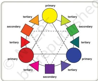
Read the colour wheel the way a written answer should describe it: the circles mark the three primaries — red, yellow and blue, which cannot be made by mixing any other colours. The squares mark the secondaries — orange, green and violet, each made by mixing two primaries.
The small triangles mark the six tertiary colours — red-orange, yellow-orange, yellow-green, blue-green, blue-purple and red-purple — each made by mixing a primary with an adjacent secondary (pp. 159–160).
Value, Tints and Shades
Value is the lightness or darkness of a hue, measured on the grey scale from 0 to 10; white has maximum value and black has the least. A hue lightened toward white is a tint; a hue darkened toward black is a shade (p. 160).
Chroma, the third specification, is the brightness or purity of the colour — dullness appears when a colour is blended with another colour, specifically with the colour opposite to it on the wheel (p. 161).
Colour Schemes and Harmonies
A colour scheme only suggests which hues may combine — the values, intensities and quantities are the designer’s or the consumer’s decisions (p. 163). Schemes fall into two groups: related and contrasting.
| Related scheme | What it uses |
|---|---|
| Monochromatic | One hue, varied in value and/or intensity |
| Achromatic | Only neutrals, such as black and white |
| Accented neutral | One hue plus a neutral (achromatic) colour |
| Analogous | Two or three hues lying side by side on the wheel; four or more may jumble unless each is in a very small quantity |
| Contrasting scheme | What it uses |
|---|---|
| Complementary | Two hues directly opposite each other on the wheel |
| Double complementary | Two pairs of complements, generally neighbouring pairs |
| Split complementary | A hue, its complement and a neighbour of the complement |
| Analogous complementary | Analogous and complementary combined, with one complement dominating a group of neighbouring hues |
| Triadic | Three hues lying equidistant from one another on the wheel |
Naming Colour and the Pantone System
Colour names are borrowed from natural sources — flowers, trees and woods; food, fruits, vegetables and spices; birds, animals and fur; stones, metals, minerals and earth; pigments and paints (pp. 161–162). Because names carry a regional flavour, the same name may mean different things in different places.
International trade in textiles therefore adds numbers to names: the Pantone Shade Card gives every hue, tint and shade a code number recognised internationally, which makes fashion forecasting and orders placed in foreign lands precise (p. 162).
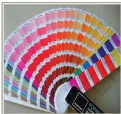
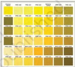
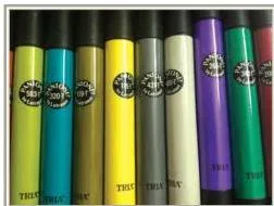
The three images above show the system at work: the shade card (Fig. 11.4) arrays the full range of hues, tints and shades in varying intensities, each with its code; the specific-order chart (Fig. 11.5) pins down exactly which colours a buyer wants; and the same standards even appear in everyday tools such as pens (Fig. 11.6).
All three say the same thing — a Pantone number travels across regions without changing meaning.
Colour in Fabric: The Three Stages
Colour can be added at three stages of fabric production, and each stage gives a different range of designs (pp. 162–163).
| Stage | Cost and use | Designs produced |
|---|---|---|
| Fibre | Rare and the most expensive process; used for manufactured fibres that are hard to dye, or when multicoloured fibre mixes are wanted | Multicoloured yarns from pre-coloured fibres |
| Yarn | Weaving with dyed yarns creates countless patterns | Stripes, checks, plaids, chambrays; brocade and jacquard; tie-dyed yarns give ikat |
| Fabric | The most common method | Solid single colours; designed materials by tie-dye and batik; painting, printing, embroidery, patch or appliqué in any shape |
Texture: Sight and Touch Together
Texture is the sensory impression of sight and touch — the tactile and visual qualities of the material. It is best described on three axes: how it looks (shiny, dull, opaque, dense, transparent, translucent, glossy), how it behaves (hangs limp, stiff, sticking out, clinging, flowing out) and how it feels (soft, crisp, harsh, smooth, rough, coarse, grainy, pebbly) (p. 164).
Five factors decide the texture of a fabric (p. 164):
- Fibre content — natural or man-made type, length, fineness and surface characteristics
- Yarn processing and yarn type — processing method, twist, fineness, and type (simple, complex, novelty, textured)
- Fabric construction technique — type of weave and its compactness, knitting, felting, braiding, lace-making
- Fabric finishes — stiffening (starching, sizing, gumming), ironing, calendering and tentering, napping, fulling
- Surface ornamentation — tufting, flock printing, embroidery, stitched effects
The purpose of texture in dress design is to create interest and enhance the desirable features of the person: textures must relate pleasingly to one another and suit the figure, personal characteristics, silhouette and occasion (pp. 164–165).
Line: Direction and Mood
Line is a mark that connects two points; it has a beginning and an end, and it can also form the outline of an object. In design it defines the shape or parts of a silhouette, provides movement and determines direction (p. 165).
- Vertical — stresses up-and-down movement and height; the effect is severe, dignified and reserved
- Horizontal — stresses side-to-side movement and creates width; it repeats the ground line, so the effect is stable and placid
- Oblique or diagonal — increases or decreases apparent width and height by its angle and direction; the effect is active, startling or dramatic
- Curved — any degree of roundness; a slight curve is restrained, a great one is circular, with named forms such as the parabola, scroll, meander, hairpin, whiplash, serpentine, figure of 8 and ogee. Long flowing curves are graceful and rhythmic; large rounded curves are dramatic and exaggerate size; tiny puffy curves are youthful and gay (p. 166)
Mood follows type: straight lines read as force, strength and rigidity (masculine when dominant); curved lines read as soft, graceful, feminine and dainty (p. 166).
Shape, Form and Pattern
Shapes are made by connecting lines, so the lines used decide the character of the shape. Shapes may be two-dimensional (a drawing or print) or three-dimensional (an object seen from several sides, like the human body or the garments on it). There are four basic groups (p. 166):
- Natural — copies nature or common man-made objects
- Stylised — simplified or modified natural shapes, sometimes with a part distorted or exaggerated
- Geometric — mathematically formed, by rulers, compasses or other measuring instruments, or giving that impression
- Abstract — free-form; they do not resemble any specific object and may represent different things to different people
In fabric, shape and form appear in the fall or drape of the material, in the shape of ornamentation and motifs, and in the placement or repeat that produces the final pattern. In apparel, they appear as the silhouette, cut and final detailing (p. 166).
A pattern is formed when shapes are grouped together — all of one shape or a mix of two or more — and the arrangement itself can be natural, stylised, geometric or abstract (p. 167).
Principles of Design: Proportion, Balance, Emphasis, Rhythm, Harmony
Principles of design are the rules that govern how design elements are mixed in the most appropriate way — proportion, balance, emphasis, rhythm and harmony. Each is a separate idea, but combining them successfully is what produces an appealing product (p. 167).
To keep all five in your head, remember: Pretty Babies Enjoy Rice Halwa — Proportion, Balance, Emphasis, Rhythm, Harmony.
Proportion: The Golden Mean
Proportion is the relation of one part of an object to another — in size, colour, shape and texture — and of each part to the whole. A good design does not permit easy dissection: the parts blend so skilfully that where one ends and another begins is not apparent (p. 167).
Proportion follows the golden mean, expressed by ratios such as \(3:5:8\) and \(5:8:13\). The smaller part (3) relates to the larger part (5) exactly as the larger part (5) relates to the whole (8).
A garment is horizontally divided in these ratios at the waist, yoke and hemline: in a skirt–blouse dress the blouse is 3, the skirt 5 and the whole 8; in a shirt–pant outfit the shirt is 5, the pant 8 and the whole 13 (p. 167).
Proportion applies beyond length.
Proportion of colour uses different colours in golden-mean areas, such as a shirt and pant worn together; proportion of texture matters because heavy, bulky textures overpower a thin, petite person; proportion of shape and form keeps motif or print size in step with the wearer — a high waist bodice in maternity clothes camouflages the fullness of the abdomen.
One rule worth quoting: equal divisions make a person look shorter and wider, while unequal horizontal divisions make a person look slimmer (pp. 167–168).
Balance: Formal, Informal and Radial
Balance is the equal distribution of visual weight from the central point of the garment, achieved both vertically (from the centre line) and horizontally (from top to bottom). It can be achieved in three ways: formal, informal and radial (p. 168).
Because the average human body is symmetrical, formal (vertical) balance — the same design on each side of the central axis — is the least expensive and most expected type of design, found on less expensive garments. It gives a feeling of stability, dignity and formality, but it tends to become monotonous.
Horizontal balance is used mainly to correct figure problems, for example a dark hue for a large size. All the elements — line, form, colour and texture — contribute to balance in a dress.
Emphasis: The Focal Point
Emphasis is the focal point — the area that first attracts the viewer’s eye. It adds interest and may be created by colour, design lines, detailing or accessories (p. 168).
Details that focus on the face are especially effective because the face is treated as the focal point of beauty in our culture — a beautiful embroidered yoke or a contrasting-colour blouse emphasises the face.
Emphasis handles figure problems in both directions: a bright, contrasting belt draws attention to a small waist (a positive), while hip-level belts or design details on large hips highlight them further (a negative). Contrasting colours, unusual shapes, lines and textures all create emphasis.
Rhythm: Moving the Eye
Rhythm is the repetition of lines, colours, other elements or details that lets the eye flow through the garment. It is created by arranging lines, shapes, colours and textures so they give visual unity. The four mechanisms (pp. 168–169):
- Repetition — embroidery, laces, buttons, piping or colour repeated at necklines, sleeves and hemlines
- Gradation — a gradual increase or decrease in the size of motifs, lines, buttons, colours or textures
- Radiation — the eye moves out in an organised way from a central point, as with gathers at the waist, yoke or cuffs
- Parallelism — elements lie parallel to each other, such as tucks in a yoke, knife pleats in a skirt, or bands of colour
Harmony and Composition
Harmony (unity) is created when all the elements of design come together to give a pleasing, harmonious effect. It is a critical factor in producing marketable, publicly acceptable designs (p. 169).
- Harmony by shape — all areas of the garment reflect the same shape: a curved collar, cuff and hem would be interrupted by square pockets
- Harmony by texture — separate pieces must agree in texture: a cotton dupatta worn with a silk kurta and salwar is bad harmony
Composition is the artwork or concept developed by arranging the elements and applying the principles in the best possible way in a given space — 2-dimensional or 3-dimensional. The creator selects only two or three principles that best suit the final work and its visual appeal (p. 169).
Which principle matters most? None by itself. The principles work together, and harmony is the outcome of the other four.
Design Vocabulary: Key Terms and Definitions
One lookup table for every key term — meanings in your own words, each with an example and a page reference. Use it to revise fast and to check your answer language.
| Term | Meaning | Example |
|---|---|---|
| Design | Planning and creation of an object for a specific purpose; the fullest design integrates aesthetics with utility (p. 157) | A dress that is both beautiful and functional — not mere decoration |
| Structural design | The part of design that depends on the object’s form, not on superimposed ornamentation (p. 158) | In fabric: the weave or knit; in a dress: the cut or silhouette |
| Applied design | Design superimposed on the basic structure of the object (p. 158) | Printing or embroidery on fabric; trims and notions on a garment |
| Elements of design | The tools of the art, manipulated to create pleasing results (p. 158) | Colour, texture, line, shape/form |
| Principles of design | Rules that govern how the elements are mixed (pp. 158, 167) | Proportion, balance, emphasis, rhythm, harmony |
| Hue | The common name of a colour (p. 159) | Red, yellow, blue |
| Value | The lightness or darkness of a hue, judged on the 0–10 scale (p. 160) | Light blue and navy differ in value |
| Intensity / chroma | The brightness or purity of a colour (p. 161) | A vivid orange vs a dull, brownish orange |
| Tint | A hue lightened toward white (p. 160) | Pale pink is a tint of red |
| Shade | A hue darkened toward black (p. 160) | Maroon is a shade of red |
| Achromatics | Neutral colours — colours without colour (p. 160) | White, black, grey, silver, metallics |
| Primary colours | Colours that cannot be produced by mixing any other colour (p. 159) | Red, yellow, blue |
| Secondary colours | Colours made by mixing two primary colours (p. 159) | Orange, green, violet |
| Tertiary colours | Colours made by mixing a primary with an adjacent secondary (p. 160) | Red-orange, yellow-green, blue-purple |
| Monochromatic harmony | A harmony based on one hue, varied in value and/or intensity (p. 163) | Deep navy, sky blue and powder blue together |
| Achromatic harmony | Uses only neutrals (p. 163) | A black-and-white combination |
| Accented neutral | One hue plus a neutral or achromatic colour (p. 163) | A grey dress with a red scarf |
| Analogous harmony | Two or three hues lying side by side on the colour wheel (p. 163) | Yellow, yellow-orange and orange |
| Complementary harmony | Two hues lying directly opposite one another on the wheel (pp. 163–164) | An orange kurta with a blue dupatta |
| Split complementary | A hue, its complement and a neighbour of the complement (p. 164) | A three-colour harmony built on one hue plus the two neighbours of its complement |
| Triadic harmony | Three hues lying equidistant from one another on the wheel (p. 164) | Red, yellow and blue in a print |
| Texture | The sensory impression of sight and touch — a material’s tactile and visual qualities (p. 164) | Silk: shiny to look at, flowing in behaviour, smooth to feel |
| Straight vs curved lines | Straight lines are rigid and unbroken; curved lines have any degree of roundness (pp. 165–166) | A vertical seam (straight) vs a flowing curve |
| Natural shapes | Shapes that copy nature or common man-made objects (p. 166) | Leaf-shaped motifs |
| Stylised shapes | Simplified or modified natural shapes, sometimes distorted or exaggerated (p. 166) | A simplified flower print |
| Geometric shapes | Shapes formed mathematically, with rulers or compasses (p. 166) | Circles and squares in a border |
| Abstract shapes | Free-form shapes that do not resemble any specific object (p. 166) | Splashes of colour in an all-over print |
| Pattern | Shapes grouped together in a planned arrangement (p. 167) | A repeated border motif |
| Proportion | The relation of one part of an object to another and to the whole (p. 167) | Golden-mean divisions at the waist, yoke and hem |
| Golden mean | A pleasing ratio in which the smaller part relates to the larger as the larger relates to the whole (p. 167) | Blouse : skirt : total = 3 : 5 : 8 |
| Balance | Equal distribution of visual weight from the central point of the garment (p. 168) | Formal (symmetrical), informal or radial balancing |
| Emphasis | The focal point that first attracts the viewer’s eye (p. 168) | A bright contrasting belt on a small waist |
| Rhythm | Repetition of elements or details that makes the eye flow through the design (p. 168) | Repeated piping at the neckline and hem |
| Harmony (unity) | All elements coming together to give a pleasing whole (p. 169) | A silk kurta and salwar with a matching silk dupatta |
| Composition | The artwork made by arranging elements and applying principles in a given 2-D or 3-D space (p. 169) | A dress built using balance and rhythm together |
| Pantone | A numbered card system covering every hue, tint and shade, recognised internationally (p. 162) | A shade-card code quoted in a foreign order |
| Tie and dye | Resist dyeing in which tightly wound thread keeps dye out of the tied areas (p. 171) | Bandhej (dots), laheria (stripes) |
| Batik | Resist printing in which wax resists the dye and dyeing is done cold (p. 174) | Crackle lines where the wax cracks |
| Block printing | One of the oldest methods of applying a design onto fabric, with a separate carved block per colour (p. 175) | Wooden blocks printing border patterns |
Numbers in Design: Ratios, the Grey Scale and Colour-Mixing Rules
This chapter has no equations, but five number-facts are worth quoting exactly in an answer: the golden-mean ratios, the grey scale, the colour-mixing rules, the wavelength effect and the batik temperature.
| Fact | The number | Where it matters |
|---|---|---|
| Golden mean ratios | \(3:5:8\) and \(5:8:13\) | Horizontal divisions of a dress at the waist, yoke and hemline (p. 167) |
| Grey scale | 0 to 10 (11 grades): 0 = black, 10 = white, 5 = mid grey or mid hue | Judging the value of any hue; the dark half holds shades, the light half holds tints (pp. 160–161) |
| Colour mixing | Two primaries make a secondary; one primary + an adjacent secondary makes a tertiary; opposites on the wheel are complements | Reading the colour wheel and naming every harmony (pp. 159–160, 163–164) |
| Wavelength effect | Short wavelengths are receding/restful; long wavelengths are advancing/stimulating | Explaining why red feels stimulating and blue restful (p. 159) |
| Batik dyeing temperature | Below \(35^\circ\text{C}\) | Keeping the wax resist intact during dyeing (p. 174) |
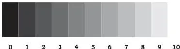
Read the grey scale the way a written answer should: the strip runs from 0 to 10. At 0 is black, at 10 is white, and 5 is the mid value for grey or for any hue. The darker half, 0 to 5, holds shades (dark value); the lighter half, 5 to 10, holds tints (light value).
The same scale is used to judge the equivalent value of any hue (p. 160).
Memory device for the direction: tints run toward Ten, shades sink toward Zero — a tint moves a hue up the scale toward white (10), and a shade moves it down toward black (0).
One caution on the colour rules: two primaries always make a secondary — \( \text{red} + \text{yellow} \rightarrow \text{orange} \), \( \text{red} + \text{blue} \rightarrow \text{violet} \), \( \text{yellow} + \text{blue} \rightarrow \text{green} \) — and opposites on the wheel are complements. These rules are the building blocks behind every colour-harmony name.
Worked Examples: Analysing Colour, Proportion and Texture
Each example names its method first, then works through it step by step. The measurements in Example 2 are original — repeat the same steps with your own numbers.
Worked Example 1: Classifying Colour Harmonies
Method: check the hues against the wheel. Directly opposite hues are complementary; side-by-side hues are analogous; three equally spaced hues are triadic. Then name the scheme.
Step 1 (a): A dupatta in deep navy, sky blue and powder blue.
All three are blues of one hue differing in value (lightness).
One hue varied in value gives monochromatic harmony (p. 163).
Step 2 (b): An orange kurta worn with a blue dupatta.
Orange and blue lie directly opposite each other on the wheel, so this is complementary harmony (pp. 163–164).
Step 3 (c): A print using red, yellow and blue in equal areas.
These three hues are equally spaced around the wheel, so this is triadic harmony (p. 164).
Final answers: (a) monochromatic, (b) complementary, (c) triadic.
Worked Example 2: Golden Mean Division of a 156 cm Dress
Method: split the total length in the ratio \(5:8\) with the blouse as the smaller part, then check that the pieces match the ratio and add back to the total.
- Step 1: Count the total parts in the ratio \(5:8\): \(5 + 8 = 13\) parts.
- Step 2: Find the size of one part: length ÷ parts \(= 156 \div 13 = 12\ \text{cm}\).
- Step 3: Blouse (the smaller part) \(= 5 \times 12 = 60\ \text{cm}\).
- Step 4: Skirt (the larger part) \(= 8 \times 12 = 96\ \text{cm}\).
- Step 5: Check — \(60 : 96 = 5 : 8\) (both sides divide by 12), and \(60 + 96 = 156\ \text{cm}\).
Final answer: blouse 60 cm and skirt 96 cm. Equal halves would make the wearer look shorter and wider; the unequal \(5:8\) division looks slimmer (p. 168).
Worked Example 3: Why the Same Kurta Reads Differently in Two Fabrics
Method: compare the two materials on all five texture-deciding factors, then state the visual and tactile result.
Step 1: Fibre content.
Khadi is cotton — a short, somewhat uneven natural fibre with an irregular surface.
Polyester georgette is made of smooth, continuous filaments.
Different surfaces reflect light differently and touch differently (p. 164).
Step 2: Yarn processing and type.
Khadi yarn tends to be coarse with uneven twist; georgette uses fine, highly twisted yarns.
The identical kurta pattern therefore drapes stiffly in khadi and falls softly in georgette.
Step 3: Construction.
Khadi is an open handloom weave; georgette is a more compact machine weave.
That changes the opacity, drape and cling of the fabric.
Step 4: Finishes.
Khadi may be starched or calendered for stiffness, while georgette is usually heat-set and soft — two very different handles.
Step 5: Surface ornamentation.
Embroidery, prints or stitched effects add interest to both, but they sit on different base fabrics, so the final look still differs.
Conclusion: the pattern is identical but the texture is not — khadi reads stiff, rustic and casual, while georgette reads soft, flowing and formal. The five factors explain every difference.
Applied Design in the Lab: Tie and Dye, Batik and Block Printing
The three practicals are examples of applied design: colour and ornamentation added after the fabric’s structure exists. Tie and dye and batik are resist techniques; block printing applies colour directly from the carved block. The difference is what that something is.
Tie and Dye
Tie and dye is resist dyeing with tightly wound thread. The areas to stay in pattern are wound with thread before dyeing; when the cloth is dipped, the tied areas retain the original ground colour (p. 171). The classic names are bandhani, chunari and laheria, made at homes in Gujarat and Rajasthan.
Two typical designs: bandhej (countless dots) and laheria (diagonal stripes). Before tying, wash the cloth in hot soapy water so the dye is absorbed evenly (p. 173).
The five tying techniques (pp. 171–173):
- Knotting — the easiest and quickest method; knots vary with the fabric’s size, shape and grain; best results come on fine fabric, which yields shaded circular patterns.
- Marbling — gather the fabric into a ball and tie it in all directions until it becomes a solid mass, or twist and coil it lengthwise; this gives variegated, irregular cloud-like effects, usually dyed in light colours, and it can be repeated in two or more colours to build a multicoloured background.
- Binding — parts are bound very tightly with thread as dots, bands, lines, criss-cross or spiral; the designs are straight or diagonal stripes (lehria) and circles or spots (bandhej).
- Tritik or sewing — tacking stitches are sewn along a definite pattern with a strong thread carrying a large knot; the thread is pulled so the cloth gathers closely and knotted again; the result is pleasing bands of dotted texture.
- Folding — fabric folded into pleats, squares or triangles and held by binding (thread) or clipping; this creates symmetrical stripes, bands and squares, works best on thick materials because the fabric itself forms the resist, and can later serve as a base for block printing and embroidery.
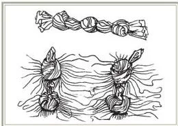
Fig. 11.8 demonstrates knotting: the fabric is simply tied, and on fine cloth the tied knots read as shaded circular patterns in the dyed result (p. 171).
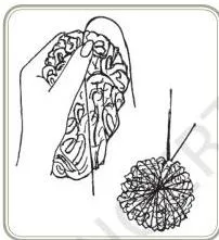
Fig. 11.9 shows the marbling setup — fabric gathered into a ball and tied in all directions until it is a solid mass. Dyeing this ball gives the variegated, cloud-like marbled effect that later supports a more definite pattern (p. 172).
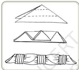
Fig. 11.12 shows folding: the fabric is pleated or folded into shapes and held with binding or clips, producing symmetrical stripes, bands and squares, with the best effects on thick materials (p. 173).
Batik
Batik is resist printing with wax. Wax is applied on the fabric in a design, and dyeing is carried out cold so the wax does not melt; colour is confined to the unwaxed areas. The beauty of batik lies in the cracks the wax develops during dyeing — colour enters through these cracks and leaves crackle lines (p. 174).
- Waxes: light, easily removed paraffin wax; darker, more adhesive bees wax. Taking both in varied proportions gives different types of cracks.
- Application: use brushes with natural hair bristles (not nylon or thermoplastic); methods are painting, outlining, dry brushing (a shaded effect along design lines) and scratching (a design line scratched through a waxed area with the back of a pin or brush). The wax should reach both sides of the material.
- Dyeing: use dyes applied below \(35^\circ\text{C}\) — commonly ice colours or batik colours. Multiple colours come from repeated cycles of wax application, wax removal, fresh waxing and dyeing in another colour.
- Wax removal: dry the fabric, freeze it in a waterproof packet, crush the frozen wax to dust, remove the rest by hot-pressing between absorbent paper, then soap it at the boil (pp. 174–175).
Block Printing
Block printing is one of the oldest methods of applying a design onto fabric. A separate block is required for each colour in the finished design: the design area is raised, while the background that is not to be printed is carved away.
Blocks are mostly wood, with metal used to reinforce parts; they may carry single motifs, border patterns or all-over patterns (p. 175).
The printing sequence: lay the fabric flat on a padded table covered with a protective sheet and fix it firmly so it cannot move; press the block lightly into the printing tray (dye paste on a sponge base) so the raised surface takes a uniform layer; then press the block onto the fabric with enough force to drive the colour in.
For multicoloured work, print the outline block first in the darkest colour, then the filling blocks in lighter colours. Leave the fabric to dry, then hot-press it from the wrong side (p. 175).
Tie and Dye, Batik and Block Printing Compared
The textbook teaches the three techniques separately, so it is easy to blur them. This table lines them up side by side — resist, application, temperature and effect — for one-screen revision.
| Feature | Tie and dye | Batik | Block printing |
|---|---|---|---|
| Resist material | Tightly wound thread | Wax (paraffin and/or bees wax) | None stated — the raised block carries dye paste to the fabric |
| How the resist is applied | Knotting, gathering, binding, sewing or folding the fabric | Wax brushed on by painting, outlining, dry brushing or scratching | Block pressed onto the fabric surface |
| Dyeing temperature | No limit stated — a simple dip after tying (pp. 171–173) | Below \(35^\circ\text{C}\) so the wax does not melt (p. 174) | Not a dye bath — dye paste is carried by the block (p. 175) |
| Signature effect | Dots (bandhej), stripes (laheria), marbled clouds | Crackle lines where the wax cracked | Repeated motifs in clear, block-like repeats |
| Example names | Bandhani, chunari, laheria | Batik crackle work | Block-printed borders and all-over patterns |
Class Activities 1 and 2
Activity 1 (p. 164): collect samples of fabric, printed paper, illustrations of dresses and room interiors, then analyse the colour harmonies in each, specifying hue, value and intensity. Activity 2 (pp. 164–165): collect textile samples showing different textures, describe each in terms of how it looks, behaves and feels, and analyse which of the five factors produced that texture.
Careers and Scope: Where Fabric and Apparel Design Leads
Fabric and apparel design has expanded into two specialisations: fabric design (fabric used in many things beyond apparel and household articles) and apparel design (apparel made from materials beyond just fabric). Each use has specific requirements of appearance, durability and cost allocation (p. 169).
A designer must know fibre characteristics — advantages and limitations, processing, the dyeing properties of different fibres and fabrics, and the stages and techniques of colour application — and must understand the principles of design (pp. 169–170).
Courses run from certificates and diplomas to associate and bachelor’s degrees, offered by many kinds of institutes, and the right choice depends on the unique qualities of each programme.
On scope, the chapter notes that the design industry is a vibrant, varied and dynamic creative sector: textile designers work in industry, for design agencies or as freelancers, and must keep producing designs that are fresh, current or even ahead of the fashion curve. Textile designs for apparel fashion have a quicker turnaround than designs for furnishing (p. 170).
The ground built here feeds directly into the unit’s next area, Fashion Design and Merchandising.
Common Mistakes: What Students Write vs What Is Correct
These are the wrong ideas that slip into answers and practical write-ups. The third column gives the quick way to prove the correct version.
| Students write… | Correct is… | Why / how to check |
|---|---|---|
| Colour is a property of the object. | Colour is the visual sensation produced when reflected light strikes the retina. | An object looks white when all rays reflect and black when none reflect (p. 159). |
| A tint is any light colour; a shade is any dark colour. | A tint is a hue lightened toward white; a shade is a hue darkened toward black. | Judge on the 0–10 value scale — the direction toward white or black is what defines them (pp. 160–161). |
| Dyeing at the fibre stage is the cheapest. | It is the most expensive, so it is rarely done. | It is used only when manufactured fibres are hard to dye or when multicoloured fibre mixes are needed (p. 162). |
| Tie and dye and batik are the same technique. | Both are resist dyeing, but the resists differ — thread in tie and dye, wax in batik. | Batik must dye below \(35^\circ\text{C}\) so the wax stays intact; tie and dye has no such limit (pp. 171, 174). |
| Printing and embroidery are structural design. | They are applied design. | Structural design comes from construction, weave or cut; applied design is superimposed on the structure (p. 158). |
| Horizontal lines make a person look taller. | Vertical lines stress height; horizontal lines add width and stability. | Vertical stresses up-and-down movement; horizontal repeats the ground line (p. 165). |
| In block printing, one block prints every colour. | A separate block is needed for each colour. | The outline block prints first in the darkest colour, then the filling blocks in lighter colours (p. 175). |
| Complementary colours sit side by side on the wheel. | They lie directly opposite; side-by-side hues are analogous. | Contrast comes from opposition, while proximity gives related schemes (pp. 163–164). |
Exam Notes: Answering the Review Questions Completely
The chapter closes with five review questions on p. 170. Each skeleton below lists what a complete answer must contain — write each out in full sentences and use the list as a self-check.
Review Question 1: What do you understand by the term ‘design’?
- State that design is not mere decoration; an object must be functional and appropriate to its use
- Give the broadest sense: harmony in form
- Quote the textbook line — design is “the human power to conceive, plan, and realise products…” — and explain it in your own words
- Close with the integration point: the greatest harmony comes when the aesthetic aspect is integrated with utility, and a good design gives people what they expect in price, colour and service (pp. 157–158)
Review Question 2: What are the factors that affect the texture of a fabric during its manufacture?
A complete answer lists all five factors with one clause of explanation each (p. 164):
- Fibre content — type (natural or man-made), length, fineness, surface characteristics
- Yarn processing and yarn type — processing method, twist, fineness, simple/complex/novelty/textured types
- Fabric construction technique — weave type and compactness, knitting, felting, braiding, lace-making
- Fabric finishes — stiffening (starching, sizing, gumming), ironing, calendering and tentering, napping, fulling
- Surface ornamentation — tufting, flock printing, embroidery, stitched effects
Review Question 3: How does the application of colour during the different stages of fabric manufacture affect the design in fabric?
- Fibre stage — rare and most expensive; used for hard-to-dye manufactured fibres or multicoloured fibre mixes
- Yarn stage — stripes, checks, plaids, chambrays; brocade and jacquard from weaving dyed yarns; ikat from tie-dyed yarns
- Fabric stage — the most common method; solid colouring plus tie and batik; painting, printing, embroidery and patch or appliqué in any shape (pp. 162–163)
Review Question 4: What are the different types of lines and shapes? How do they create different effects and moods?
- Straight lines: vertical (height, dignity), horizontal (width, stability), oblique (activity, drama)
- Curved lines: restrained vs circular; long flowing (graceful), large rounded (dramatic, exaggerates size), tiny puffy (youthful)
- Mood contrast: straight = forceful and masculine; curved = soft and feminine
- Four shape groups with definitions: natural, stylised, geometric, abstract
- Link the two: line characteristics decide shape characteristics, and shapes group into patterns (pp. 165–167)
Review Question 5: How do you achieve rhythm and harmony in dress?
- Rhythm — by repetition (embroidery, laces, buttons, piping), gradation (gradual size change), radiation (gathers at waist, yoke, cuffs) and parallelism (tucks, knife pleats, bands of colour)
- Harmony by shape — all areas echo the same shape; square pockets would break a curved collar, cuff and hem
- Harmony by texture — a silk kurta and salwar with a cotton dupatta is poor harmony
- Close with the definition: harmony is all the elements together producing a pleasing whole (pp. 168–169)
Answering Practical-Description Questions
For any of the three practicals, build the answer in this order: name the technique → state what acts as the resist → list the steps in order → name the pattern effect produced → add fabric suitability.
Include small labelled diagrams of the tying techniques (knot, marbled ball, binding, tritik stitches, folding) and keep the completeness detail: wash the cloth in hot soapy water before tying so the dye absorbs evenly (p. 173).
Rapid Revision: Fabric and Apparel in One Page
Three tables compress the whole chapter — use them in the last minutes before revision ends.
| Element | One-line meaning | Main effect in dress |
|---|---|---|
| Colour | Visual sensation from reflected light; specified by hue, value, intensity | Identity and mood; receding vs advancing effects |
| Texture | Sight and touch qualities — how it looks, behaves, feels | Creates interest; enhances desirable features |
| Line | A mark connecting two points | Direction, movement and mood; height vs width |
| Shape / form | Forms made by connecting lines | Drape, motifs and repeats; silhouette and cut |
| Pattern | Shapes grouped together | The final decorative arrangement |
| Principle | One-line meaning | How it is achieved in dress |
|---|---|---|
| Proportion | Relation of parts to each other and the whole | Golden mean divisions \(3:5:8\) at waist, yoke and hemline |
| Balance | Equal visual weight from the central point | Formal (symmetrical), informal and radial balancing |
| Emphasis | The focal point that first draws the eye | Colour, design lines, detailing, accessories near the face |
| Rhythm | The eye flows through the garment | Repetition, gradation, radiation, parallelism |
| Harmony | All elements together give a pleasing whole | Matching shapes and textures across all pieces |
| Technique | Resist | Constraint | Signature effect | Examples |
|---|---|---|---|---|
| Tie and dye | Tightly wound thread | Pre-wash in hot soapy water | Dots, stripes, marbled clouds | Bandhej, laheria, chunari |
| Batik | Wax | Dye below \(35^\circ\text{C}\) | Crackle lines | Batik crackle work |
| Block printing | Carved block | Separate block per colour; darkest outline first | Repeated motifs | Border and all-over prints |
Page map in two lines: elements of design pp. 158–167; principles pp. 167–169; careers and scope pp. 169–170; practicals pp. 171–175. For the rest of your board-year revision, the Class 12 notes hub covers every subject, inside the wider CBSE notes library.
Reference: NCERT Class 12 Human Ecology and Family Sciences Part II textbook, chapter Design for Fabric and Apparel.
Frequently Asked Questions
What is the difference between structural design and applied design?
Structural design depends on the form of the object itself — in fabric, the fibre, yarn, weave or knit; in a dress, the basic cut or silhouette. Applied design is superimposed on that structure — dyeing, printing, embroidery and fancy needlework on fabric; trims and notions on garments (NCERT, p. 158).
How do you find the complementary colours of any hue on the colour wheel?
Locate the hue on the colour wheel and look directly across the centre: the colour opposite is its complement — for orange that is blue. Colours lying side by side are analogous, not complementary (pp. 163–164).
What five factors decide the texture of a fabric?
Fibre content (type, length, fineness, surface characteristics); yarn processing and yarn type (processing method, twist, fineness, simple/complex/novelty/textured); fabric construction technique (weave type and compactness, knitting, felting, braiding, lace-making); fabric finishes (starching, sizing, gumming, ironing, calendering and tentering, napping, fulling); and surface ornamentation (tufting, flock printing, embroidery, stitched effects) (p. 164).
What is the difference between tie and dye, batik and block printing?
All three are resist techniques, but the resist differs. Tie and dye uses tightly wound thread and gives dots (bandhej) or stripes (laheria). Batik uses wax and must be dyed below \(35^\circ\text{C}\), so its signature is the crackle lines where wax cracks.
Block printing is not a dye bath at all: carved blocks press dye paste onto the fabric, one block per colour (pp. 171, 174–175).
How does the golden mean ratio 3:5:8 apply to dress design?
The golden mean says the smaller part relates to the larger part as the larger part relates to the whole. In a skirt–blouse dress the blouse is 3, the skirt 5 and the total 8; in a shirt–pant outfit the shirt is 5, the pant 8 and the total 13. These divisions fall at the waist, yoke and hemline (p. 167).
Why do fabric brands use Pantone numbers instead of colour names?
Colour names come from nature and vary with region, so a name in one area can mean something different in another. Pantone shade cards give every hue, tint and shade a code number recognised internationally, which keeps foreign textile orders and fashion forecasting exact (p. 162).
Explore Class 12 Home Science Notes
- Class 12 Home Science Notes
- Class 12 CBSE Notes
- CBSE Notes for Classes 1 to 12
- Next: Fashion Design and Merchandising
Class 12 Home Science on LearnCBSE:
Related chapters:
- Care and Maintenance of Fabrics in Institutions notes
- Hospitality Management notes
- Consumer Education and Protection notes
Official source: download the NCERT textbook free from ncert.nic.in.