
Chapter 1 of the NCERT Class 12 Geography practical book, Practical Work in Geography, Part-II, is titled Data — Its Source and Compilation. This 12-page chapter is the foundation of the book: it defines what data is, where data comes from, and how raw numbers become tables, classes and graphs.
The official Data — Its Source and Compilation Class 12 NCERT PDF is right here on this page. The sections below explain the chapter’s ideas in plain language, with NCERT page references so you can follow in your own copy. This page is maintained for the 2026-27 academic session.
Download the Official Chapter PDF
| What the chapter holds | Count | Where it is used |
|---|---|---|
| Printed pages | 12 | |
| Figures with NCERT captions | 8 | |
| Tables | 11 | |
| Activities | 1 | |
| Official NCERT PDF | Download the chapter PDF | the chapter exactly as NCERT publishes it |
The full book, including this chapter, is free on the NCERT website. Open the Data — Its Source and Compilation Class 12 NCERT PDF to read the chapter exactly as printed — the worked tally table, the frequency tables, the index number table and the graphs — straight from the official NCERT file.
Chapter at a Glance
The chapter contents table on this page shows the chapter’s size at a glance — its pages, sections, figures, tables, formulas and activities.
What This Chapter Covers
This chapter turns raw measurements — from the field and from records — into organised, presentable, analysable information. It moves in one direction, and knowing the path helps you see why each step exists (NCERT, pp. 1–12):
- What data is and why geography needs it (NCERT, pp. 1–2) — the definitions of datum, data and information, and the shift from qualitative description to quantitative analysis.
- Primary and secondary sources of data (NCERT, pp. 2–6) — first-hand collection by observation, interview, questionnaire and schedule, against published and unpublished records.
- Tabulation and presentation (NCERT, pp. 6–7) — the same data expressed as absolute values, percentages or index numbers.
- Grouping raw data into classes (NCERT, pp. 7–10) — the tally mark method, frequency tables, and the exclusive and inclusive ways of drawing class limits.
- Graphing the distribution (NCERT, pp. 10–11) — the frequency polygon and the less than and more than ogives.
- Exercises and an activity (NCERT, p. 12) — three sets of questions, closing with a classroom grouping activity.
What is Data, and What Makes It Information?
A single number is not yet information. The chapter’s first job is to separate the three words — datum, data, information — because every later step builds on that difference (NCERT, p. 1).
Datum is a single measurement; data are numbers that represent measurements from the real world.
The chapter’s examples are the kind you see daily: 20 centimetres of rain in Barmer, 35 centimetres of rain at a stretch in Banswara within 24 hours, or the New Delhi–Mumbai rail distance of 1385 km by the Kota–Vadodara route and 1542 km by the Itarsi–Manmad route (NCERT, p. 1).
Raw numbers are hard to draw conclusions from on their own. Data become information only when they are algorithmically derived, logically deduced or statistically calculated from multiple data. The book defines information as a meaningful answer to a query, or a meaningful stimulus that can cascade into further queries (NCERT, p. 1).
Why geography needs data: relationships between phenomena over the earth’s surface are best explained in quantitative terms, so statistical analysis of those variables has become a necessity. The chapter proves the point with two examples (NCERT, p. 2):
| What you want to study | Statistical information the chapter lists |
|---|---|
| Cropping pattern of an area | cropped area, crop yield and production, irrigated area, amount of rainfall, inputs such as fertiliser, insecticides and pesticides (p. 2) |
| Growth of a city | total population, density, number of migrants, occupations and salaries of people, industries, means of transportation and communication (p. 2) |
The conclusion is the chapter’s main theme: geography has shifted from qualitative description to quantitative analysis. Precise techniques now run from the first step of collecting data to the last step of drawing conclusions (NCERT, p. 2).
Primary Sources of Data: Observation, Interview, Questionnaire and Schedule
A primary source is data collected for the first time by an individual, a group or an institution. Its opposite, the secondary source, is data taken from published or unpublished records (NCERT, p. 2). Fig. 1.1 shows the whole scheme: every method of data collection hangs off one of these two branches.
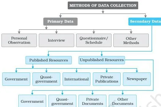
Under the primary branch, the chapter lists four methods. Personal observation means collecting information directly in the field: relief features, drainage patterns, soil types, natural vegetation, population structure, sex ratio, literacy, transport and communication, and urban and rural settlements. The observer needs theoretical knowledge of the subject and a scientific attitude for unbiased evaluation (NCERT, pp. 2–3).
Interview gets direct information from a respondent through dialogue and conversation (NCERT, p. 3). The book gives interviewers eight precautions:
- prepare a precise list of the items of information you need;
- be clear about the objective of the survey;
- take the respondent into confidence and assure secrecy before sensitive questions;
- create a congenial atmosphere so the respondent speaks without hesitation;
- keep the language simple and polite;
- avoid questions that hurt self-respect or religious feelings;
- invite any additional information the respondent can offer;
- thank the respondent for the time given.
Questionnaire and schedule look alike — both carry structured questions on paper — but differ in who fills them. The difference is easy to mix up, so fix it with a comparison:
| Feature | Questionnaire | Schedule |
|---|---|---|
| Who fills it | The respondent fills it themselves by ticking or writing | A trained enumerator fills it by asking the respondent |
| Who it can reach | Only literate, educated respondents | Both literate and illiterate respondents |
| Best use | Surveys of a large area; can even be mailed to far-flung places | Face-to-face collection where the enumerator visits |
That is why the schedule’s main advantage over the questionnaire is that it collects information from literate and illiterate respondents alike (NCERT, p. 4).
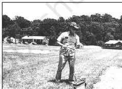
Other methods collect data without asking anyone. Soil properties are measured directly with a soil kit, water properties with a water quality kit, and field scientists measure the health of crops and vegetation using transducers (NCERT, p. 4). Fig. 1.2 shows the kind of direct field measurement this involves.
Secondary Sources of Data: From Census Reports to the Internet
Secondary data already exists in records — you borrow it rather than gather it yourself. The chapter groups secondary sources into published and unpublished records (NCERT, pp. 2, 4).
The published side has six groups (NCERT, pp. 4–5):
- Government publications — the most important group: the Census of India from the Office of the Registrar General, National Sample Survey reports, Indian Meteorological Department weather reports, state Statistical Abstracts and the periodic reports of Commissions.
- Semi/quasi-government publications — reports and papers of Urban Development Authorities, Municipal Corporations and Zila Parishads.
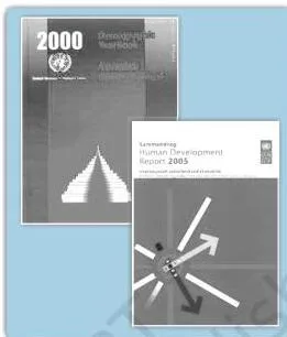
- International publications — yearbooks, reports and monographs of UN agencies: UNESCO, UNDP, WHO and FAO, including the Demographic Year Book, the Statistical Year Book and the Human Development Report.
- Private publications — yearbooks, surveys, research reports and monographs from newspapers and private organisations.
- Newspapers and magazines — dailies, and weekly, fortnightly and monthly magazines, the most easily accessible sources.
- Electronic media — especially the internet, now a major source of secondary data.
Fig. 1.3 shows a sample of these government publications, and Fig. 1.4 shows the United Nations publications that anchor the international group.

The unpublished side has three groups (NCERT, pp. 5–6):
- Government documents — reports and records maintained at different levels of governance; the village-level revenue records kept by the patwari are the chapter’s example.
- Quasi-government records — periodic reports and development plans of Municipal Corporations, District Councils and Civil Services departments.
- Private documents — unpublished reports and records of companies, trade unions, political and apolitical organisations and residents’ welfare associations.
Three Ways to Present Data: Absolute Values, Percentages and Index Numbers
Once data are tabulated, the book presents them in one of three forms — absolute values, percentages or index numbers — and the choice depends on the comparison you want to make (NCERT, p. 6).
Absolute data are the original figures, presented as integers: the total population of a country or the total production of a crop. Table 1.1 gives the 2011 Census population of India and selected states — India’s total of 1,21,05,69,573 persons is an absolute value (NCERT, p. 6).
Percentage or ratio data are computed from a common parameter, such as the literacy rate or the growth rate of population (NCERT, p. 6). The chapter’s formula for literacy rate is:
\[ \text{Literacy rate} = \frac{\text{Total Literates}}{\text{Total Population}} \times 100 \]
Table 1.2 applies the formula to Indian literacy across the decades: 18.33% in 1951, rising to 73.0% in 2011, with male and female rates shown for every census year (NCERT, pp. 6–7).
Index numbers measure change in a variable or a group of related variables with respect to time, geographic location or other characteristics. They compare not only periods of time but also different cities, industries or countries (NCERT, p. 7). The simple aggregate method is the most common:
\[ \text{Index number} = \frac{\sum q_i}{\sum q_0} \times 100 \]
where \( \sum q_i \) is the total of the current year’s production, \( \sum q_0 \) is the total of the base year’s production, and the base year itself is taken as 100 (NCERT, p. 7). Table 1.3 computes this for iron ore in India with 1970–71 as the base year: 32.5 million tonnes gives 100, and 67.4 million tonnes in 2000–01 gives 207.
Worked example — a new series: suppose a district’s wheat production (in thousand tonnes) was 48 in 2005–06, 54 in 2026-27, 63 in 2026-27 and 72 in 2026-27. Take 2005–06 as the base year.
Step 1: Fix the base year.
Production in 2005–06 is \( \sum q_0 = 48 \) thousand tonnes, and the base year’s index is by definition 100.
Step 2: For every later year, divide that year’s production by the base year’s production and multiply by 100.
\[ \frac{54}{48} \times 100 = 112.5 \qquad \frac{63}{48} \times 100 = 131.25 \qquad \frac{72}{48} \times 100 = 150 \]
Final answer: the index rises from 100 to 112.5, then 131.25, then 150 across the three later years, meaning production in 2026-27 is 50 per cent above its 2005–06 level.
| Year | Production (thousand tonnes) | Calculation | Index number |
|---|---|---|---|
| 2005–06 (base) | 48 | \( \frac{48}{48} \times 100 \) | 100 |
| 2026-27 | 54 | \( \frac{54}{48} \times 100 \) | 112.5 |
| 2026-27 | 63 | \( \frac{63}{48} \times 100 \) | 131.25 |
| 2026-27 | 72 | \( \frac{72}{48} \times 100 \) | 150 |
The index rises from 100 to 150, which means wheat production in 2026-27 was 50 per cent higher than in the base year — a comparison the absolute numbers (48 against 72) show less directly.
Grouping Raw Data: Class Intervals and the Tally Mark Method
Collected data first appears as a jumble with little meaning — that is why it is called raw data — and it needs tabulation and classification before it is usable (NCERT, p. 6). The simplest organising device is a statistical table: a systematic arrangement in rows and columns that simplifies presentation, eases comparison and lets a reader locate a value quickly (NCERT, p. 6).
The chapter then processes the scores of 60 students in a geography paper (Table 1.4, NCERT, pp. 7–8). The scores run from 02 to 96, so ten classes with an interval of ten units each are a convenient choice: 0–10, 10–20, 20–30, and so on up to 90–100 (NCERT, p. 8).
Each score is assigned to its class by the four-and-cross method, also called tally marks (NCERT, p. 8):
- one tally mark is recorded for each individual in the class it falls into;
- the first score in the table, 47, falls in the 40–50 class and earns its first tally there;
- four vertical marks are crossed by the fifth mark — hence the name “four and cross”;
- the count for each class is called its frequency.
The number of individuals in each class is the simple frequency (\( f \)). The sum of all simple frequencies equals the total number of observations, written in the chapter as \( \sum f = N = 60 \) (NCERT, pp. 8–9).
Adding simple frequencies class by class gives the cumulative frequency (\( C_f \)): 4, then 4 + 5 = 9, then 9 + 5 = 14, and so on to a final total of 60 (NCERT, p. 9).
The payoff is fast reading. A cumulative frequency of 27 in the 40–50 row means 27 students scored less than 50, and 45 of the 60 students lie below the score of 70 (NCERT, p. 9).
Exclusive and Inclusive Methods: Where Does a Boundary Value Go?
When a score equals a class limit, it has to be placed in one class only. The two ways of drawing class limits answer the question differently (NCERT, pp. 9–10).
Exclusive method (NCERT, p. 9): the upper limit of one class is the lower limit of the next. Classes are read as “0 and under 10”, “10 and under 20”, “20 and under 30”, and so on.
A value of 30 therefore belongs to 30–40, where it is the lower limit, and is excluded from 20–30, where it would be the upper limit. Every class still spans ten units — the third group holds 20, 21, 22, up to 29, but not 30.
Inclusive method (NCERT, p. 10): both limits belong to the same class, and the upper limit of one class differs from the lower limit of the next by one. The group 50–59 includes all ten values from 50 to 59, and each class still covers ten units.
| Boundary value | Exclusive method — goes to | Inclusive method — goes to |
|---|---|---|
| 9 | 0–10 (0 and under 10) | 0–9 |
| 10 | 10–20 (10 and under 20) | 10–19 |
| 29 | 20–30 (20 and under 30) | 20–29 |
| 30 | 30–40 (30 and under 40) | 30–39 |
The rule of thumb: in the exclusive method a boundary value always moves up into the higher class; in the inclusive method it stays with the class whose limits already contain it.
Key Terms From Chapter 1, Defined Simply
If a term turns blurry while you revise, this table is the fastest way back. Keep a finger on your copy of the book — the page numbers tell you where each term is stated.
| Term | Plain meaning | NCERT page |
|---|---|---|
| Datum | A single measurement | p. 1 |
| Data | Numbers that represent measurements from the real world | p. 1 |
| Information | A meaningful answer to a query, or a meaningful stimulus that can cascade into further queries, obtained by deriving, deducing or calculating from data | p. 1 |
| Primary source | Data collected for the first time by an individual, group or institution | p. 2 |
| Secondary source | Data taken from published or unpublished records | p. 2 |
| Raw (absolute) data | Collected data in their original form, as integers, before tabulation | p. 6 |
| Statistical table | A systematic arrangement of data in rows and columns that simplifies presentation and comparison | p. 6 |
| Index number | A statistical measure showing change in a variable or group of related variables over time, location or other characteristics | p. 7 |
| Simple frequency (\( f \)) | The number of individuals falling in each class | p. 9 |
| Cumulative frequency (\( C_f \)) | The running total obtained by adding each simple frequency to the previous sum | p. 9 |
| Exclusive method | Classes in which the upper limit of one group is the lower limit of the next; boundary values go to the higher class | p. 9 |
| Inclusive method | Classes in which both limits belong to the same group; boundary values stay in their own class | p. 10 |
| Frequency polygon | A graph of a frequency distribution, useful for comparing two or more distributions | p. 10 |
| Ogive | The curve obtained by plotting cumulative frequencies | p. 10 |
Frequency Polygon and Ogive: Drawing the Data
This is the chapter’s graphical payoff: a frequency distribution can be seen, not just read. Two graphs matter — the frequency polygon and the ogive, pronounced ojive (NCERT, p. 10).
A frequency polygon is a graph of the frequency distribution. Its special value is comparison — you can plot two or more distributions on one graph and see which has the greater concentration (NCERT, p. 10). Fig. 1.5 shows the polygon drawn against the bars of the same distribution, so you can see both representations together.
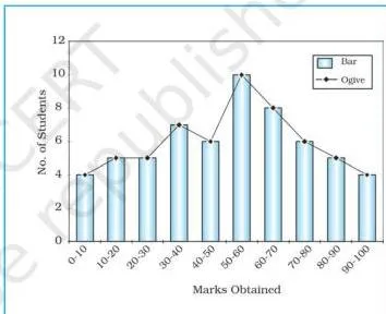
An ogive is the curve obtained by plotting cumulative frequencies, and it is built in either of two ways (NCERT, pp. 10–11):
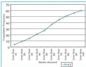
Less than method — start with the upper limits of the classes and add the frequencies as you go. Table 1.8 gives the points (“less than 10” = 4, “less than 20” = 9, up to “less than 100” = 60), and plotting them gives a rising curve (Fig. 1.6).
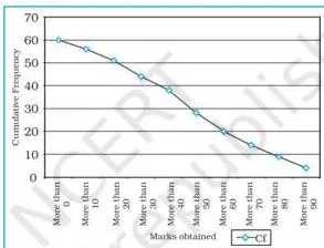
More than method — start with the lower limits of the classes, and subtract each class frequency from the running cumulative total. Table 1.9 gives the points (from “more than 0” = 60 down to “more than 90” = 4), and plotting them gives a declining curve (Fig. 1.7).
The two curves can be drawn on one graph. Table 1.10 places the less than and more than cumulative values side by side for every class, and Fig. 1.8 plots both curves on the same axes to give a comparative picture of the distribution (NCERT, p. 11).
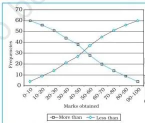
To tell them apart instantly: the less than ogive climbs because added frequencies only grow; the more than ogive falls because each subtraction shrinks the remaining total.
Common Mistakes Students Make in This Chapter
A few errors trap almost everyone here, and NCERT plants its own warning about the first one on page 2. A traveller crossing a river with his wife and five-year-old child measured the depth at four points — 0.6, 0.8, 0.9 and 1.5 metres (NCERT, p. 2).
The average came to \( (0.6 + 0.8 + 0.9 + 1.5) \div 4 = 0.95\ \text{m} \) — below his child’s height of 1 metre. So he led the family across, and the child drowned.
Why the average misled him: no stretch of the river is actually 0.95 metres deep. The three shallow readings dragged the mean below 1 metre, while the deepest stretch, 1.5 metres, was far above the child’s height.
An average flattens the spread of values, so a single summary figure can deviate you from the real situation — NCERT’s term for this is the statistical fallacy (NCERT, p. 2).
Then the operational errors, each with its correction:
| Mistake | Correct rule | How to check your answer |
|---|---|---|
| Trusting an average without checking the spread — the statistical fallacy of the river-crossing story | An average hides how values are distributed; look at the whole range before concluding | Compare each value with the mean: the 1.5 m depth sits well above the 0.95 m average, exactly what the traveller missed (p. 2) |
| Placing a boundary value in the lower class under the exclusive method (30 placed in 20–30) | 30 belongs to 30–40 because it is the lower limit there; classes read as “20 and under 30” | Ask “is 30 under 30?” — it is not, so it cannot stay in 20–30 (p. 9) |
| Confusing the questionnaire with the schedule | The respondent fills the questionnaire; a trained enumerator fills the schedule by asking the respondent | Ask who holds the pen: the respondent (questionnaire) or the enumerator (schedule) (p. 4) |
| Reading a cumulative frequency as a simple frequency — \( C_f \) = 27 in the 40–50 row read as “27 students scored between 40 and 50” | \( C_f \) = 27 means 27 students scored less than 50 — everyone from the lowest class up to 40–50 inclusive | Re-add the simple frequencies: 4 + 5 + 5 + 7 + 6 = 27 (p. 9) |
| Index-number slips — forgetting the base year equals 100, or inverting the fraction | \( \frac{\sum q_i}{\sum q_0} \times 100 \): current year on top, base year on the bottom | Recompute the base year itself — any value divided by itself, times 100, must give exactly 100 (p. 7) |
Exam Notes: What to Practise From This Chapter
Because this is a practical-work chapter, revision means doing the procedures, not memorising prose. The closing exercises (NCERT, p. 12) test four transferable skills:
- building a tally table from raw marks — the four-and-cross method and \( \sum f = N \) (p. 8);
- computing an index number with a stated base year (p. 7);
- converting a frequency table into less than and more than cumulative tables and plotting the ogives (pp. 10–11);
- placing boundary values under the exclusive and inclusive methods (pp. 9–10).
Here is what each closing exercise actually asks (NCERT, p. 12):
| Exercise | What it tests |
|---|---|
| Q1(i) — a number or character that represents measurement | The definition of data — the answer is (b) Data (compare p. 1) |
| Q1(ii) — a single datum is a single measurement from the … | Datum as a measurement from the real world — (c) Real world (p. 1) |
| Q1(iii) — grouping by four and crossing the fifth | The name of the tally method — (a) Four and Cross Method (p. 8) |
| Q1(iv) — an ogive is a method in which … | That the ogive plots cumulative frequencies — (d) Cumulative frequency is plotted (p. 10) |
| Q1(v) — both ends of a group taken into the class | The inclusive method — (b) Inclusive Method (p. 10) |
| Q2(i) — differentiate data and information | The raw-numbers vs meaningful-answer distinction (p. 1) |
| Q2(ii) — what is data processing? | Tabulation and classification of raw data so it becomes usable (pp. 6–7) |
| Q2(iii) — advantage of a footnote in a table | Why tables carry source notes: the chapter’s own tables print “Source: Census, 2011” or the report name below the data, telling readers where the figures came from (pp. 6–7) |
| Q2(iv) — what are primary sources of data? | Data collected for the first time (p. 2) |
| Q2(v) — enumerate five secondary sources | The published/unpublished split — any five of the book’s nine groups (pp. 4–6) |
| Q3(i) — agencies that supply secondary data, national and international | Government publications (Census, NSS, IMD) against UN agencies (UNESCO, UNDP, WHO, FAO) and their yearbooks (pp. 4–5) |
| Q3(ii) — importance of an index number and how to calculate it | The definition of an index, the simple aggregate formula and a full worked example with a base year (p. 7) |
Close with the chapter’s own activity as a self-test: group the unit-test marks (out of 10) of 35 students into a grouped frequency distribution, then do the same with your own class’s last test result (NCERT, p. 12). If you can finish both without looking back, the chapter’s procedures are yours.
One honest caveat: textbook contents and the examinable syllabus are not always identical — check the current official syllabus for what is examinable this session.
Chapter 1 in Brief: Data — Its Source and Compilation
This chapter prints no closing summary, so here is a recap in a few sentences. Data are numbers that represent measurements from the real world, and a single measurement is a datum (p. 1). Geography needs data because relationships such as cropping patterns and city growth are best explained in quantitative terms (p. 2).
Data come from primary sources, collected first-hand, or secondary sources, drawn from published and unpublished records (pp. 2–6). Once collected, data are tabulated and presented as absolute values, percentages or index numbers (pp. 6–7).
Raw data are grouped into classes with the four-and-cross tally method, building a frequency distribution with a simple frequency and a cumulative frequency for every class (pp. 8–9). Class limits follow the exclusive method, where boundary values move to the next class, or the inclusive method, where both ends are kept (pp. 9–10).
The distribution is finally drawn as a frequency polygon, and as less than and more than ogives (pp. 10–11).
Related Resources
Continue revising from the Class 12 Geography notes hub, or browse the wider Class 12 notes hub for every subject. From the CBSE notes home page you can jump to any class or subject.
If you are moving into human geography, the Class 12 Geography notes on the world population are a natural follow-up. For the official files, the NCERT textbook page for Practical Work in Geography, Part-II hosts every chapter of this book.
Sources and Data Verification
- This page describes Chapter 1, “Data — Its Source and Compilation”, of the NCERT Class 12 Geography textbook Practical Work in Geography, Part-II. All page and figure references match the official edition on ncert.nic.in.
- It covers this single chapter only — not the other chapters of this book, and not the companion Class 12 Geography title.
- The listing is maintained for the current academic session using the NCERT information available to this site.
- NCERT settles textbooks, editions and PDFs; CBSE settles curriculum, syllabus and examinations.
Reference: NCERT Class 12 Practical Work in Geography, Part-II textbook, chapter 1, official edition on ncert.nic.in.
FAQs
What is the difference between data and information in Class 12 Geography Chapter 1?
Data are numbers that represent measurements from the real world; a single measurement is a datum. They become information only when they are algorithmically derived, logically deduced or statistically calculated from multiple data — information is a meaningful answer to a query, or a meaningful stimulus that can cascade into further queries (NCERT, p. 1).
What is a statistical fallacy, and what example does NCERT use to explain it?
It is the mistake of drawing a conclusion from an average without seeing how the values are spread. The chapter’s example: a traveller measured river depths of 0.6, 0.8, 0.9 and 1.5 metres, averaged them to 0.95 metres and led his 1-metre-tall child to cross — the child drowned because part of the river was deeper than the average suggested (NCERT, p. 2).
What is the difference between a questionnaire and a schedule?
The respondent fills the questionnaire himself or herself, while a trained enumerator fills the schedule by asking the respondent. That is why a schedule reaches literate and illiterate respondents alike, while a questionnaire reaches only literate, educated people (NCERT, p. 4).
In the exclusive method, which class does a boundary value like 30 belong to?
30 belongs to the 30–40 class. In the exclusive method a value equal to a class limit is included where it is the lower limit and excluded from the class where it would be the upper limit — the classes are read as “0 and under 10”, “10 and under 20”, and so on (NCERT, p. 9).
How do you calculate an index number by the simple aggregate method?
Use \( \frac{\sum q_i}{\sum q_0} \times 100 \), where \( \sum q_i \) is the current year’s total and \( \sum q_0 \) is the base year’s total, and set the base year itself to 100 (NCERT, p. 7). For example, production of 72 thousand tonnes against a base-year figure of 48 gives \( \frac{72}{48} \times 100 = 150 \).
What is the difference between a less than ogive and a more than ogive?
The less than ogive starts from the upper class limits and adds frequencies as it goes, producing a rising curve. The more than ogive starts from the lower limits and subtracts each class frequency from the running cumulative total, producing a declining curve. Both plot cumulative frequencies and can be drawn on the same axes for comparison (NCERT, pp. 10–11).
Explore Class 12 Geography Books
- Next: The World Population
Related chapters:
- Human Geography
- Population
- Human